






Full Morphos 3D
Use when the full name can stay readable. Best for websites, documents, signage, and wider branded layouts.


Use the full Morphos 3D lockup when the company name remains clear. Choose the compact M3D lockup in a fixed-width placement where the longer name would become too small, especially on apparel and other physical items.
Use when the full name can stay readable. Best for websites, documents, signage, and wider branded layouts.

Use when size and visual impact matter more than spelling out the name. Best for apparel, equipment, packaging, and limited-width physical placements.
Both examples use the same available width. With fewer characters sharing the space, the M3D letterforms and butterfly have more visual presence.
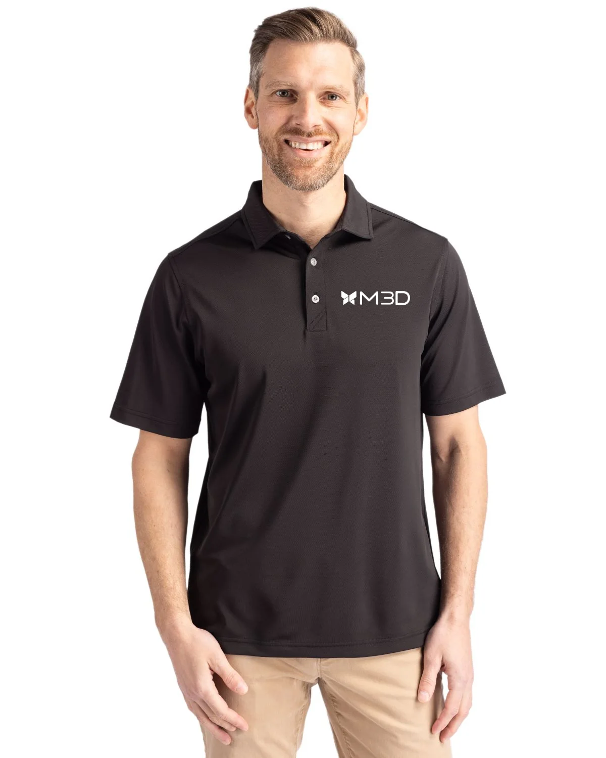
The M3D lockup keeps the butterfly and lettering clear at a left-chest size. Use the black artwork on light materials and the white artwork on dark materials. Keep the supplied proportions and clear space intact.
The full-color logo is the default for light digital applications. The white logo is the contrast-safe version for dark, saturated, or photographic backgrounds.
Use on pure white and light neutral gray. This is the default for social media, email signatures, digital documents, presentations, and most online graphics built on a light surface.
Use on black, navy, saturated colors, and dark photography. On black, the full-color butterfly icon may be used by itself when contrast is strong, but the full wordmark should be white.
Keep the supplied gradient and blue wordmark unchanged. Choose the full wordmark when the name needs to be visible, and the icon when the available space is compact or square.

Digital default: If the layout is white or light gray, start with the full-color logo. Use the icon-only version for profile images, avatars, favicons, and other compact placements.
The full-color wordmark has a narrow approved background range. If the blue lettering or gradient loses clarity, switch to the white artwork instead of changing the logo.
Keep the supplied white artwork unchanged, centered, and surrounded by clear space. Use it where the full mark remains easy to recognize.

Background note: The red and green tiles demonstrate use on partner-owned colors. They do not add colors to the Morphos 3D palette.
Use the official files as supplied. If the white mark is not clear on the intended background, switch to the full-color version or add a solid backing panel.
| Element | Font | Weight | Size | Line Height |
|---|---|---|---|---|
| H1 (Hero) | Plus Jakarta Sans | 700 | 48-56px | 1.1 |
| H2 (Section) | Plus Jakarta Sans | 700 | 32-40px | 1.2 |
| H3 (Subsection) | Plus Jakarta Sans | 500 | 24-28px | 1.3 |
| Body | DM Sans | 400 | 16-18px | 1.6 |
| Body Bold | DM Sans | 700 | 16-18px | 1.6 |
| Small / Caption | DM Sans | 400 | 14px | 1.5 |
| Button | Plus Jakarta Sans | 500 | 14-16px | 1.0 |
| Nav | Plus Jakarta Sans | 500 | 15-16px | 1.0 |
Say it in fewer words. No filler, no corporate padding.
Use precise language. Our audience knows what a toolpath is.
Talking with engineers, not down to them. Conversational but competent.
We're good at what we do. We don't trash competitors to prove it.
 Robotics & automation, DELMIA
 Smart factory floor, DELMIA
 CAM toolpath, SOLIDWORKS
 FEA / simulation visuals
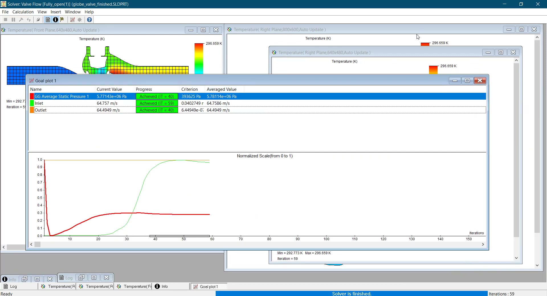 Flow & thermal analysis
 On-brand photography